statement of intent
theme
I have chosen the theme colour as my first thoughts was that colour would be an easy theme to do. As colour is all around us and I would be able to capture it.
I want to be able to show my knowledge, ideas and the development of stages throughout the project I will do this by creating a new page on Weebly that will show my progress and confidence in this subject of 'colour'. I will display the progress of the first image from my first shoot and my final shoot this will show my capability of improvement.
I will make a mood board and a mind map to show my initial ideas and understanding of the word colour. The mood board will boost my knowledge and I can always depend on it if I need inspiration.
Artist/photographER
The photographers that I found most interesting while researching the words colour in photography are Alberto Seveso, Steven Shore and David Burdeny these three photographers stood out to me the most.
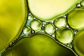
Alberto Seveso I like his work because of the way he has captured colour by using water and ink in a tank, I feel this is something that I would like to experiment with and I think this would also challenge my photography skills as I will have to adjust my camera to be able to capture the moment of the ink while it disperse in the water.
David Burdeny's work to me looks simple but shows colour from a birds eye view, I like how it reminds me of a landscape picture of fields from an aerial view but I don't think it is as how could the grass be coloured this way. I will use his inspiration of a birds eye view when taking my images as I feel this is a good angle to use.
Steven Shore's work is completely different to the first two photographers I have chose but I liked how he has captured the colours of signs on building and how simple it is but appealing to look at. The use of a plain coloured building in contrast to the bright colours of the signs.
These are the three photographers I have gained my inspiration from to begin my colour project. I may need to look at other photographers through my journey.
Experiment/equipement
The equipment I will need to use to create a studio set up is a back drop, tripod and a DSLR camera. I will need a water tank filled with water and different coloured inks. I will experiment with water and ink to try a capture work in the style of Alberto Seveso. I will also need paints and paint pallets to create work in the style of David Burneys . I will also need to go on location to capture work in the style of Steven Shore.
Proggression
I will show my progression by taking a set of photographs picking my best and worst from the shoot as this will help me show how I am refining my ideas as I go, it will also allow me to plan for my next shoot and help me to decide what I need to change an improve in the new to make my work better.
I will then use photoshop to manipulate my work and screen shoot the process to show how I have achieved my final outcome.
I will then use photoshop to manipulate my work and screen shoot the process to show how I have achieved my final outcome.
Outcome
I aim to produce a gallery of images that will show my personal response to the word colour and how I have been creative in the way I have captured my response. Linking my research of inspiration that I have gained from the photographers that I have looked at.
Mind map
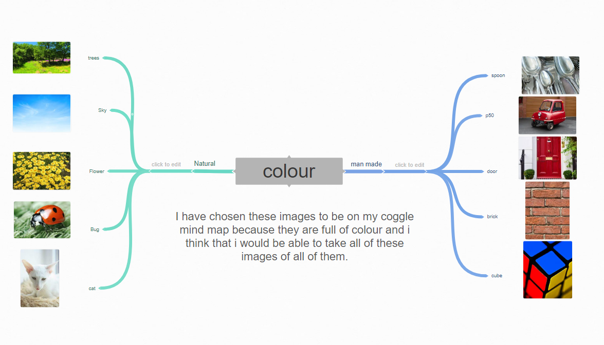
Mood board


Alberto Seveso

context
Alberto Seveso was born in 1976, he is a graphic artist, born in Milan and now working in Bristol, the UK as a freelance artist. His passion for graphic art started in the early '90s when he became fascinated with the skate decks and album covers for metal bands.
Alberto Seveso is a self-taught Italian graphic artist and illustrator, who was first inspired by artwork on skate decks and music album artwork.
His unique pieces have been featured on the covers of magazines and CDs around the world, and he’s collaborated with big names such as The Temper Trap, amongst many others. Alberto is probably best known for his portrait work and experiments using ink and high-speed photography.
composition
In my opinion the thing that stands out the most to me is the colour, you can see tones going from red to pink, dark to light blue. I like how they mix into each other and make other shades and new colours. I think that Alberto has used a tank full of water then exploded an ink capsule in the middle to get the effect that the water is fighting back the outwards force of the ink. I also think that he has used an infinity curve outside the tank to get a black void affect. To me I the image is shaped like a cloud he has captured the movement and the way the ink has mixed together. He has used a black background to create a clear out line and it has also allowed there to be shadows in the crease where the ink has mixed.
He has positioned the cloud in the center of the page as it creates a balance to the reaction of the ink, I feel red and pink is shown more in the image. It has a 3d appearances and also looks tactile however this is not a solid object it is liquid, his aim was to capture the time of the reaction which he has in liquid form. I feel he has used Photoshop to take away the glare of the water and he has enhanced the colours and played around with the contrast. A spot light may have been used as you can slightly see white areas around the bottom of the cloud however this could have been added on Photoshop.
A fast shutter speed would have been used to capture the movement and I a large depth of field as everything is in focus.
connection
My work connects with alberto's because I have taken inspiration from a lot of his exploding paint images.
I will also experiment using water and ink, this may not look as professional as Alberto's work as I have to use what is available to me however I want to capture the reaction using a fast shutter speed. I will need to use a tripod and make sure my tank is in the correct position in order to capture the images in the center.
I will also experiment using water and ink, this may not look as professional as Alberto's work as I have to use what is available to me however I want to capture the reaction using a fast shutter speed. I will need to use a tripod and make sure my tank is in the correct position in order to capture the images in the center.
comment
In my opinion I love the work of Alberto Seveso because of his use of colour and the technical side of making his images like exploding ink sachets that make the effect of the water fighting the ink and seeing the outwards force.
Richard mosse


context
Richard Mosse is an Irish conceptual documentary photographer. He was born in 1980( age 42. He went to Yale school of art in 2008.
composition
The thing that stands out to me the most is the river which is the center piece of the image and flows across the photograph, almost cutting it in two and adding a symmetrical pattern. This flowing river is a strong element to the composition of the image, with the pale blue of the water, standing out in contrast to the orange of the surrounds forest. I don't think that he has capture the natural colour of the forest but he has changed it in photoshop in my opinion. Or he may have exagerated it a bit using the saturation tool to bring out the contrasts. However if he has not used photoshop he has then captured the image at the height of the day to get a golden glow over the forest.
The photographer has been taken this photograph from a birds eye view, in my opinion he may have been in a light aircraft. Choosing this camera angle has allowed him to show the full impact of the colour and to create an almost abstract image. He would need to use a telescopic lens to capture the detail in the way that he has and set the ISO to 100, WB to sunny and have a high Fstop as we can see a deep depth of field.
The photographer has been taken this photograph from a birds eye view, in my opinion he may have been in a light aircraft. Choosing this camera angle has allowed him to show the full impact of the colour and to create an almost abstract image. He would need to use a telescopic lens to capture the detail in the way that he has and set the ISO to 100, WB to sunny and have a high Fstop as we can see a deep depth of field.
connection
Other than our theme of colour I don't think that there is that much things in common with our work, but I hope to be able to do something similar as him by trying to think how I could get some shots looking down on my objects.
comment
I chose this image because I like the range of colours he is using, they are bright but also pastel shades and this is something I might use in my own work. I also liked the way his shots seem to be quite far away and take in big colourful sceens.
DAVID BURDENY
Pink Pools, Hut Lagoon, Western Australia, 2015

context
I have been researching David Burdeny and this is the information I found on the internet:
"David Burdeny was born in 1968 and graduated with a Masters in Architecture and Interior Design and spent the early part of his career practicing in his field before establishing himself as a photographer. Burdeny translates his intimate appreciation for the structure, details and metaphorical value of space into sublime observations on how the contemporary world is still full with mystery and potential. His early work of square-format black and white images rendered space in stark, elemental terms. The spare landscapes seemed modeled to serve as liminal spaces".
This is the website I used https://www.davidburdeny.com/statement
composition
I like how he has use straight lines to guide the bold colours next to each other and I like how all the colours are contrasting to one and other. the thing that stands out to me the most is the colours they really make the image pop. In the foreground the colour red is used then the midground is a shade of pink then it goes back to the right hand corner where it is a mixture of red and pink. To me there are two leading lines however the one my eye is drawn to the most is the one on the left hand side going from the bottom of the page leading to the sweet spot which is on the left hand side and one third of the picture. David Burdeny is based on landscape images . In my opinion if this image was natural I would see the composition differently, I would see a colour less field with a river passing through the right hand side representing the brown line in this image that goes from the bottom right hand corner to the center of the page. Through my research I have dicovered that he use aerial photographer I could not find anything that shows that he uses photoshop to edit his work which makes me believe these boxes of colour are captured through aerial photography taken from a birds eye view. In some of his work he uses a slow shutter speed but you can clearly see a fast shutter speed has been used as there is no movement captured.
Connection
This connects with my work because we both do colours and I will take into consideration the bold and shaped objects I will add them into my other work. To make all my work connect to my research.
Comment
Personally I like David Burdeny's work I like how it is simple and not complex and it shows a clear understanding of colour and shows that you don't need to make fancy and technical designs to be a talented artist.
shoot plan
What equipment will I use:
|
|
How many photos will i be taking
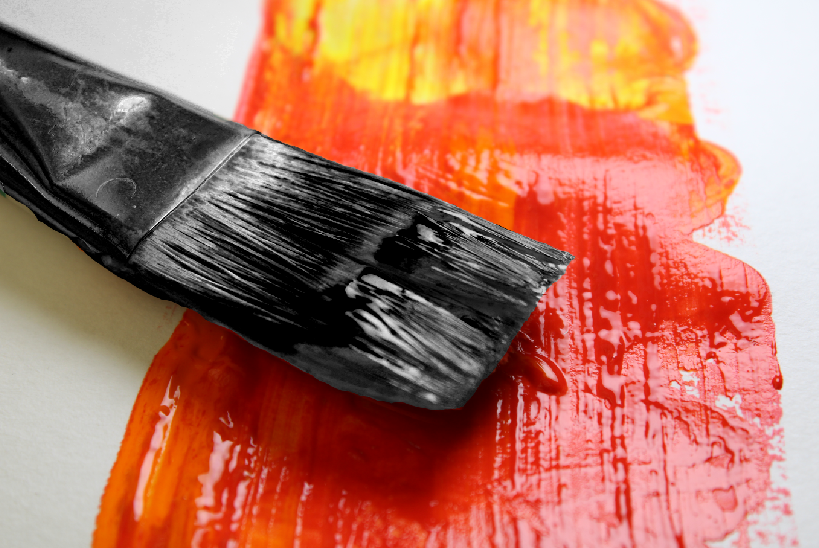
I will be taking around 15-25 of different set-ups of paint as I feel this will give me the vibrancy I am after, similar to David Burndey. I am going to use a Canon DSLR camera with a standard lens, but I may try and use the macro lens as well to zoom in on the detail. I will have to put the camera on a tripod to keep it steady and may use 1 studio light to get a highlight on the paint.
Why am i taking these photos
I am taking these photos to show off the colour section on my website and because I need to research colour and think this will be a good starting point. Once I have a bank of images, I can start to think about the direction I will take my work in and what tutorials I will need to use to help me develop my images.
Shoot one
paint brush


powder paint


work display
These are some of the tools and equipment I used to help me get these shots


Shoot two
paint strokes


messy paint


Shoot three
water colour


Best

This is my best out of the colour pallets because you can see the detail in the image and it is not bad quality.
Worst

This is my worst image of the colour pallets because it is not good quality and the focus is not right.
Photoshop: Developing my ideas
drop


Final image

brush


final Image
splat


Final image

Shoot four
For this shot I put oil paint and turps into a bowl of water to capture a marble effect. I then caught the marbling onto paper so that I could take photos of the swirling paint. I also captured the paint sitting on the water


Best
|
Worst
|
|
I picked this image for my best because I like the lighting on the image and the contrast from the red to the purple lighting.
|
I picked this image for my worst because i think it is a bit bland and boring compared to my best and other images.
|
Shoot 5
I am not going to use these images on photoshop due to the reason I think I can get better images. I am trying to capture oil paint falling into water, so I capture colour and movement. I will work on them and it would show my true potential in editing my photos .
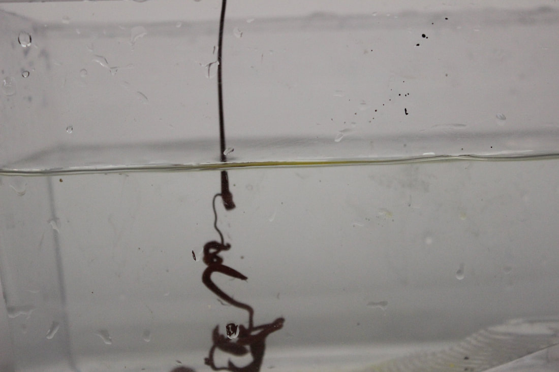


Started experiment dropping colour into water but the paint was too heavy and I could not get the effect I was after.
I am now going to try and use coloured inks to get a better outcome.
I am now going to try and use coloured inks to get a better outcome.


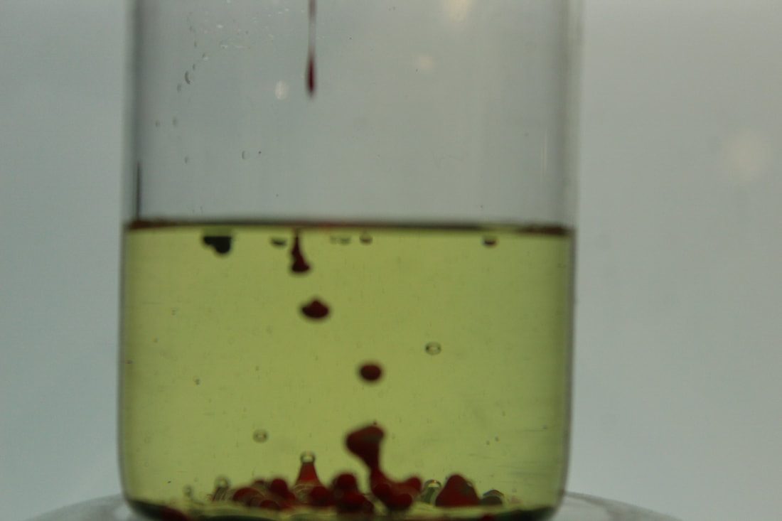
Best
I have chosen this as my best image because I like how you can see how it spreads in the water and I like the detail.
|
Worst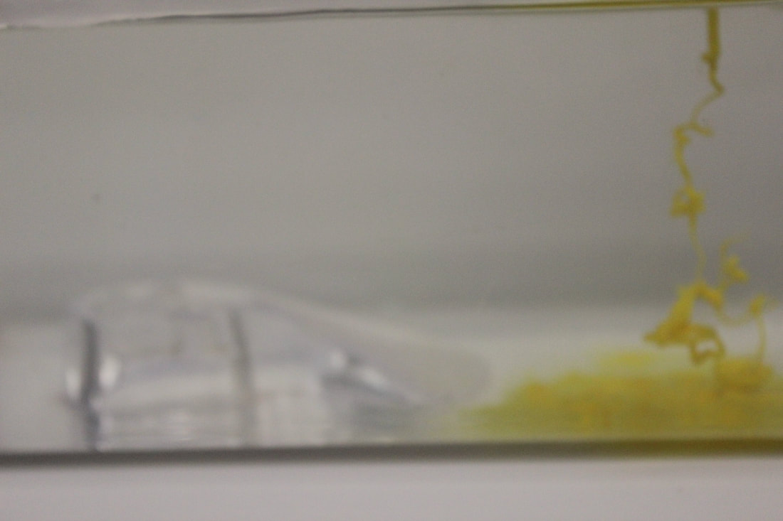
I have chosen this image as my worst because i was not able to focus the camera in time and also the camera was in the wrong position.
|


Best
I have chosen this image for my best because I like how it looks like a water fall and how it has mixed in to the water with the other paints.
|
Worst
I have chosen this image for my worst because I don't like how it has not mixed in with the other paints.
|


Photoshop developments
I uploaded images into Photoshop and explored different colour filters to enhance my images. I did not want to change them too much as I liked the image I caught through the camera lens. I like the black & white development as you can see the movement of the ink and acts as a good contrast with my colour images.


Before
|
After
|
shoot six
To make these images I had to get a light board, jar, paint, camera and oil. I put the oil in the jar then poured paint in and captured the paint seep down. I will then take the images into photoshop and edit them to make the colour stand out more.


Best
I feel like this is my best image because you can see the colour up close and the texture is good.
|
Worst
I feel like this image is my worst because a hand is in the shot that has unfocused the paint in the jar.
|

I have been on photoshop and changed the colour contrast on the image. Making the oil green really makes the paint stand out more than the original image.
Final gallery


Developing my ideas a bit further
Now I have a good set of colour images, I want to create some final outcomes that are quite creative. I am going to develop my ideas using a graphic package that will allow me to add my photos to backgrounds and build up my designs as book covers, album covers and posters. .Below are two examples i have used to inspire my own outcomes
|
|
final outcome


